
Methodology
Methods
The Carolinas Regional Explorer is built from an open, reproducible data pipeline. Every indicator is computed to the Census-tract level, carries its source and vintage, and, where it comes from a survey, carries a margin of error. This page explains, in plain language, where the data comes from and how it is processed, classified, and analyzed. For the full technical treatment and citations, see the project's methodology guide and working paper.
Geography & how areas are combined
Indicators are reported for 2020 U.S. Census tracts, neighborhood-scale areas of roughly 1,200–8,000 residents, across the 14-county Charlotte region (11 North Carolina counties: Anson, Cabarrus, Catawba, Cleveland, Gaston, Iredell, Lincoln, Mecklenburg, Rowan, Stanly, Union; and 3 South Carolina counties: York, Chester, Lancaster). The tract is the finest geography at which most public data can be reliably placed.
County values (on county profiles and the county trend line) are the authoritative county-level estimate published by the source: the U.S. Census Bureau's ACS county tables (with their own, smaller county margin of error), the CDC PLACES county model, or county zonal statistics for satellite measures. They are not an average of the county's tracts: averaging tract rates is biased toward small tracts, and you cannot average tract medians or indices (e.g. a county's median income or Gini coefficient must come from the published county figure, not from averaging its tracts).
The 14-county region has no single published estimate, so it is pooled correctly by measure type: counts are summed; rates use the pooled numerator ÷ pooled denominator; and medians and indices use a population-weighted average of the county values (a documented approximation, since an exact regional median would require microdata). Margins of error are carried through and shown as a band.
Data sources
The current release has 65 indicators from four public sources, across eight of the ten themes (Safety and Arts & Culture are still being populated):
- U.S. Census Bureau, American Community Survey (ACS) 5-Year Estimates (annual, latest 2024): demographics, economy, education, housing, transportation, health insurance, disability, residential stability, and more, published at the tract level with margins of error.
- CDC PLACES: 16 adult-health measures as model-based small-area estimates with confidence intervals: chronic conditions (obesity, diabetes, high blood pressure, asthma, depression), behaviors (smoking, inactivity), access (uninsured, routine checkup), and health-related social needs (food and housing insecurity, transportation barriers, social support, loneliness).
- USGS National Land Cover Database (NLCD): environment measures: forest, cropland/farmland, wetlands, developed land, impervious surface (annual land cover from 2001 onward), and continuous tree-canopy cover.
- EOG VIIRS Nighttime Lights: light pollution (mean night-light radiance).
Each source is tracked with its update cadence and a sustainability rating, and each indicator shows its source and vintage so you always know how current a number is. A few legacy indicators are kept at their last available year where a source has been discontinued, and labeled accordingly. Every indicator can be downloaded as CSV or JSON, and the whole dataset as a single archive, from the Data page.
How estimates are produced
Most indicators are direct estimates the ACS publishes for each tract. Health measures from CDC PLACES are model-based: they combine survey responses with population data to estimate a rate for every tract, and are flagged model-based in the app because that uncertainty is different in kind from a survey margin of error. Satellite measures (land cover, tree canopy, night lights) are wall-to-wall measurements, not surveys.
Margins of error & reliability
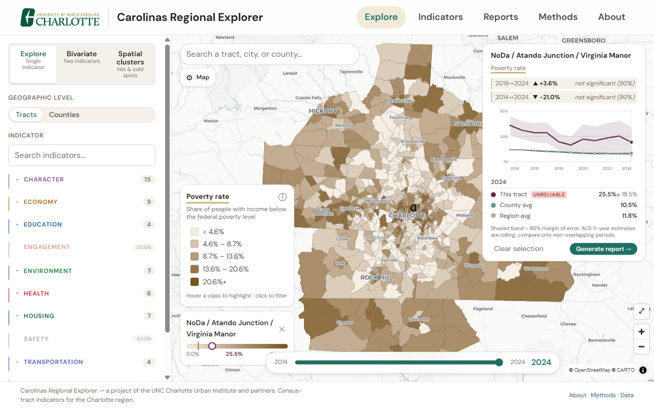
ACS figures are survey estimates, each with a 90% margin of error (MOE) that is larger for small populations. Derived rates propagate the MOE using the Census Bureau's formulas (when estimates are combined, their uncertainties add through squares and square roots, not simple addition). From the MOE we compute a coefficient of variation (CV), the typical sampling error as a percentage of the estimate, and flag each value's reliability:
ok CV ≤ 15% · caution 15–30% · unreliable CV > 30%
When you select a tract, its trend shows the estimate with a shaded ± MOE band, the reliability badge, and, for the survey-based ACS indicators, a significance-tested change (below). On the map, unreliable tracts can be drawn with a diagonal hatch (toggle under Map settings → Flag unreliable areas). Satellite-derived measures carry no sampling MOE (they have classification accuracy instead), so no band is shown for them.
Comparing over time
ACS 5-year estimates overlap from one year to the next (adjacent vintages share four years of sample), so the annual series (2014–2024) is best read as a rolling estimate. Valid change comparisons therefore use only non-overlapping periods. For a selected tract the explorer reports two changes, the 5-year (e.g. 2019 to 2024) and the 10-year (e.g. 2014 to 2024), each tested for statistical significance at 90% confidence with the Census difference test, which guards against reading sampling noise as real change. These periods advance automatically as new years are released.
CDC PLACES health measures are different. Each annual PLACES release is a separate model fit, so the multi-year series shown here is stitched across releases rather than one consistent time series. CDC states the estimates do not support tracking change over time: sub-county models hold the population distribution fixed, time is not a model variable even at county level, and apparent movement can reflect questionnaire changes or the pandemic-affected 2020 survey. The app therefore shows each year's estimate with its model uncertainty band but reports no change figure at all for these measures: no significance-tested change markers, no change column in reports, no county-card delta. Read them as levels in each year, not as a trend.
Harmonizing tract boundaries
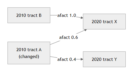
Census tract boundaries are redrawn each decade: ACS years through 2019 use 2010 tracts, and 2020 onward use 2020 tracts. Comparing an older value to a newer one therefore means comparing two different maps. To put the whole series on one 2020 geography, pre-2020 years are harmonized. We split each old tract's value across the new tracts that absorbed it, weighting by population (using 2020 Census block populations) rather than by land area, because people are not spread evenly within a tract, and a small, dense piece can hold far more residents than its area suggests. Counts are summed, margins of error are propagated, and the factors for each old tract add to one.
Environment measures (satellite rasters)
Environment indicators are computed from 30-meter satellite rasters using area-weighted zonal statistics: the exact fraction of each pixel inside a tract is used, not just whether the pixel's center falls inside. Land-cover shares (forest, farmland, wetlands, developed) are the share of a tract's land in the relevant classes; impervious surface, tree canopy, and night-light radiance are area-weighted averages.
Classification & color
Choropleth maps use quantile class breaks held consistent across years for each indicator, so a given color always means the same value range, which is what makes year-to-year change on the map legible rather than misleading. Color ramps are perceptually ordered; for indicators where higher values signal greater need, read darker shades as more need.
Bivariate analysis
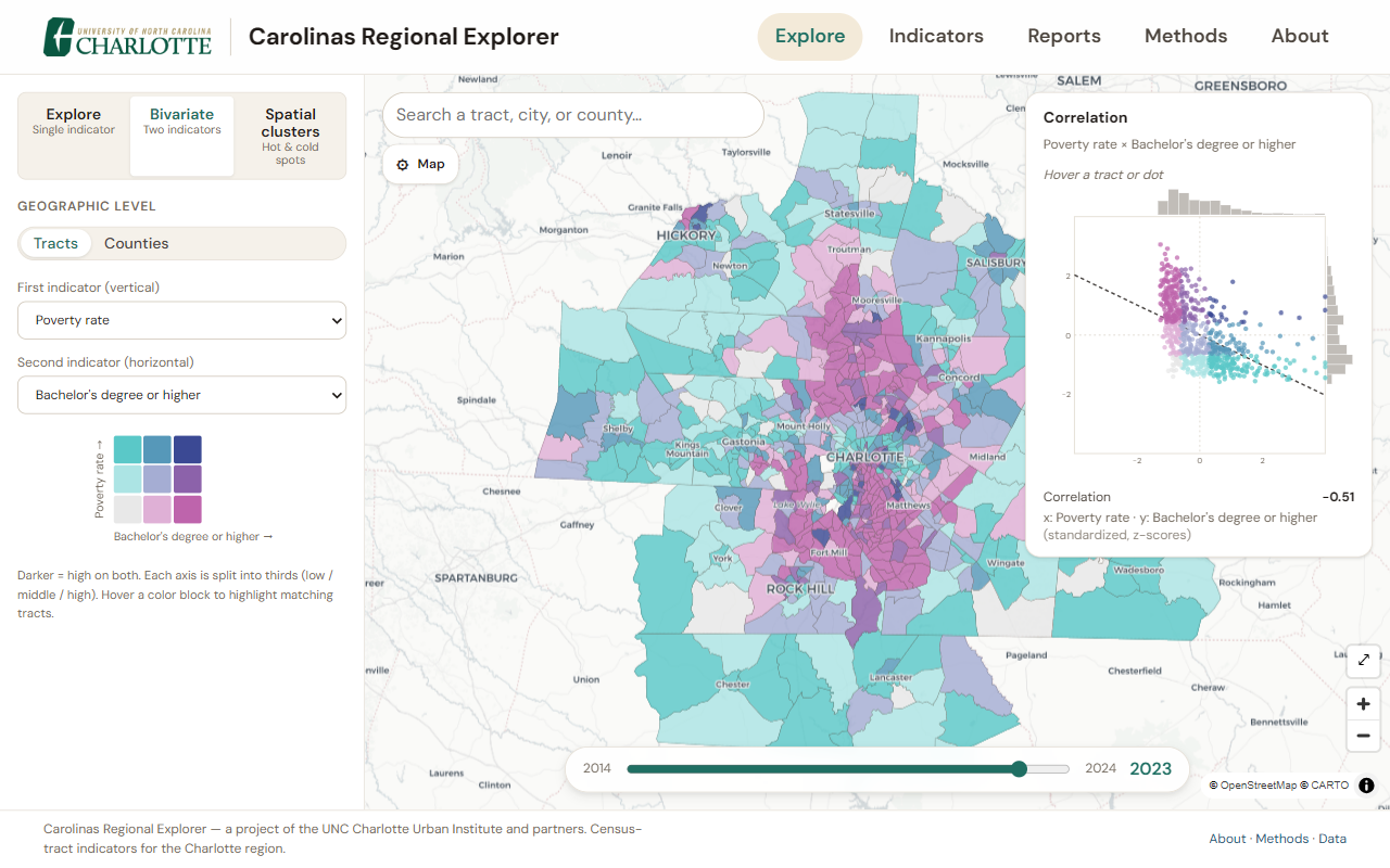
The bivariate map crosses two indicators on a 3×3 grid: each is split into thirds (low / middle / high) and the two combine into nine colors, so darker cells mark tracts that are high on both. A companion correlation scatter plots the two indicators' standardized (z-score) values, one dot per tract colored by its grid class, with the distribution of each variable along the axes, a trend line, and both the Pearson and Spearman correlations. These are descriptive only: because nearby tracts tend to be similar, an ordinary significance test would overstate confidence, so we report the relationship without a p-value. Hovering a dot or a tract links the two and names the neighborhood.
Spatial clusters (LISA)
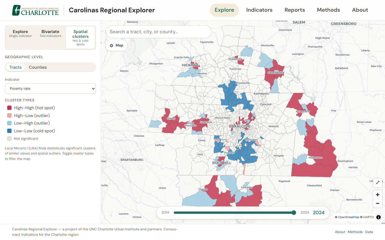
The spatial-cluster map uses Local Indicators of Spatial Association (Local Moran's I) with an 8-nearest-neighbor spatial weights matrix. Because many indicators are strongly skewed (a few tracts far above the rest), each indicator is first converted to rank-based normal scores, so the test reflects where a tract ranks in the region and a handful of extreme tracts cannot mask real clusters. Significance uses a conditional-permutation test: each tract is held fixed while its hypothetical neighbors are drawn without replacement from the other tracts (9,999 times). Because every tract is tested at once, significance is then FDR-controlled (Benjamini–Hochberg) so chance alone doesn't light up dozens of tracts. Significant tracts are labeled High–High (hot spots), Low–Low (cold spots), or High–Low / Low–High spatial outliers; "high" and "low" are relative to the region's ranking.
Neighborhood names
To help residents orient themselves, each tract is labeled with one or more nearby named neighborhoods. Names and locations come from OpenStreetMap, which records them as points. We approximate each neighborhood's extent with a Voronoi area (every location belongs to its nearest named point), measure how much of each tract falls in each neighborhood's area, and label the tract with the neighborhood(s) covering the largest share, up to three. A tract with no nearby named neighborhood (none within about 8 km) falls back to its city or county. These labels are approximate and for orientation only: neighborhood boundaries are informal and contested, and OpenStreetMap coverage varies. Neighborhood names © OpenStreetMap contributors (ODbL).
Open & reproducible
The application and the data pipeline are open source, use no proprietary GIS, and pin their software versions; each data build records the exact library versions that produced it. The data is published as a versioned, validated contract, and another region can stand up its own explorer largely by changing configuration. We document these choices, and their limitations, precisely so they can be scrutinized and improved.
Data availability
Each indicator carries its own available years and cadence; the year slider only offers years with data. Cadence varies by source: ACS is annual (rolling), CDC PLACES and the satellite layers update on their own schedules, and indicators update as new source data is released.
See also the full indicator list and About the Explorer.